The Beauty of NOAA Nautical Charts
You may not like it, but this is what peak map performance looks like*
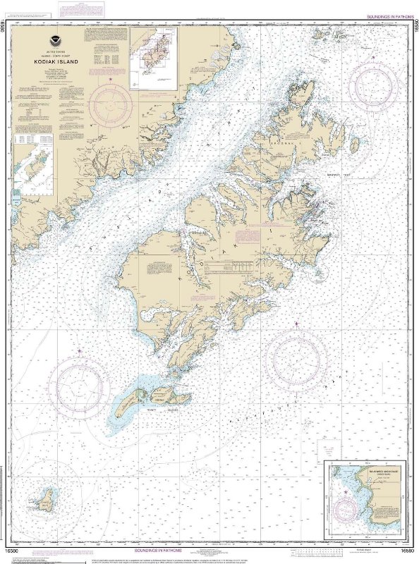
(fig. 1)
*almost, it would be best if it had Indigenous place names.
To me, NOAA nautical charts are the ideal map presentation, and I maintain that they strike an elegant balance between necessary navigational information, and an aesthetically pleasing style.
But this post isn’t truly a paean to these nautical maps, I just needed to get that out of the way. Though it is a bandwagon post.
This post is actually about disability, making bad art, pace of progression, and why embracing generative AI is a betrayal of your humanity.
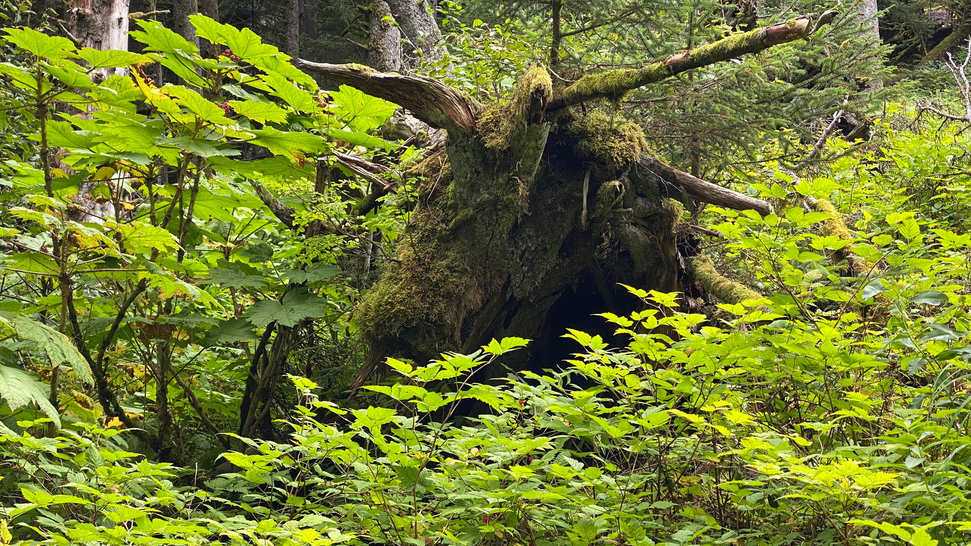
When I was ~6 years old and had my first neuropsych assessment, my fine motor skills were in the 4th percentile. Here’s a contemporary image to represent how I felt about having to manipulate objects with my hands.
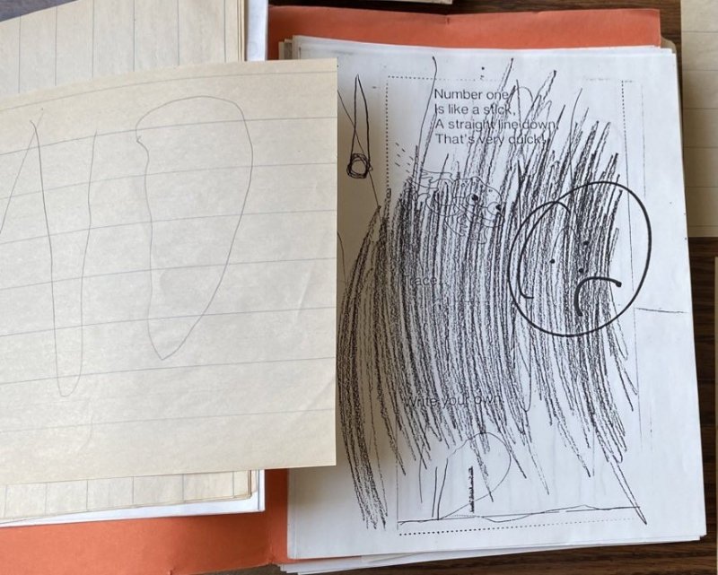
(fig. 2)
So I had to do some significant physical therapy to learn how to learn how to write (not a typo), and to this day my hands are often quite clumsy and stiff (I lament the scores of mugs and glasses I’ve broken cuz my damn hands didn’t wanna work). This obstacle is most pronounced when playing stringed instruments, but that’s a subject for a another post. I’m blessed to have all of my fingers and more or less full range of motion, so I say all this with respect to those whose physical issues exist on an entirely different scale from mine. Furthermore a crucial framing should not be “overcame disability” and should instead be “used disability to help develop individual style.”
Now we’re going to look at a series of maps to do some comparative analysis.
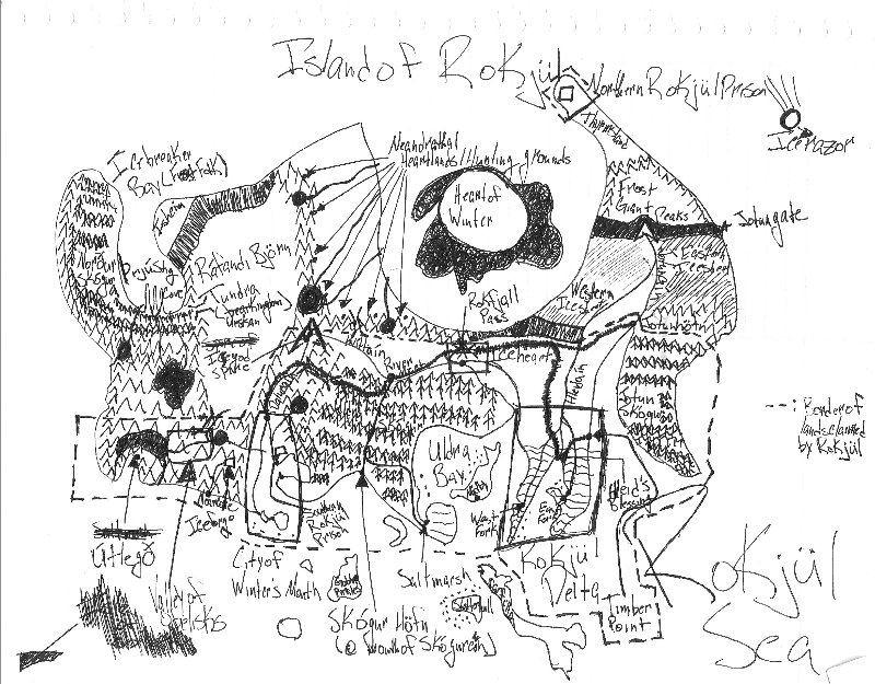
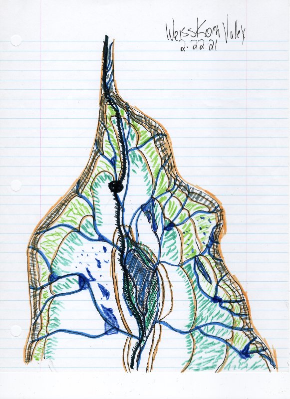
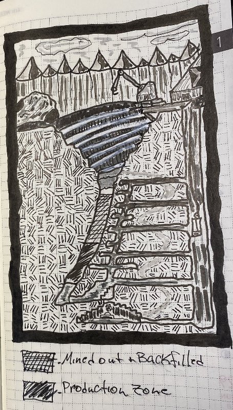
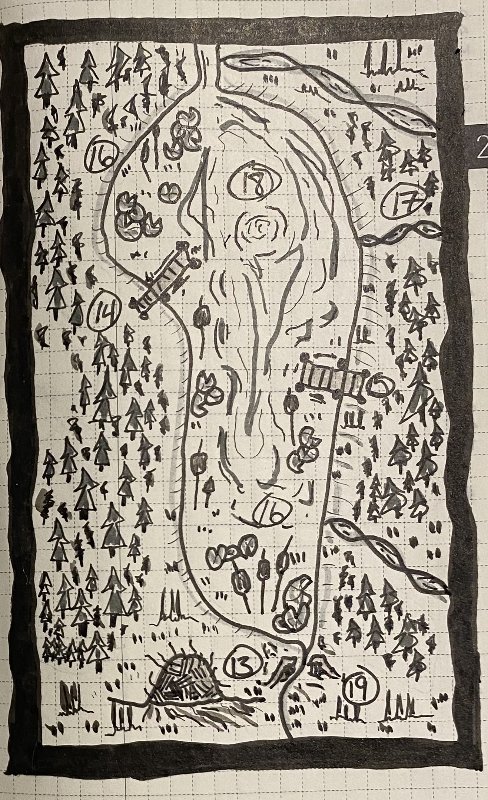
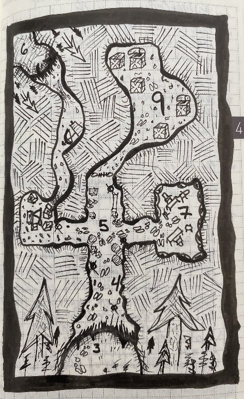
(figs. 3-6)
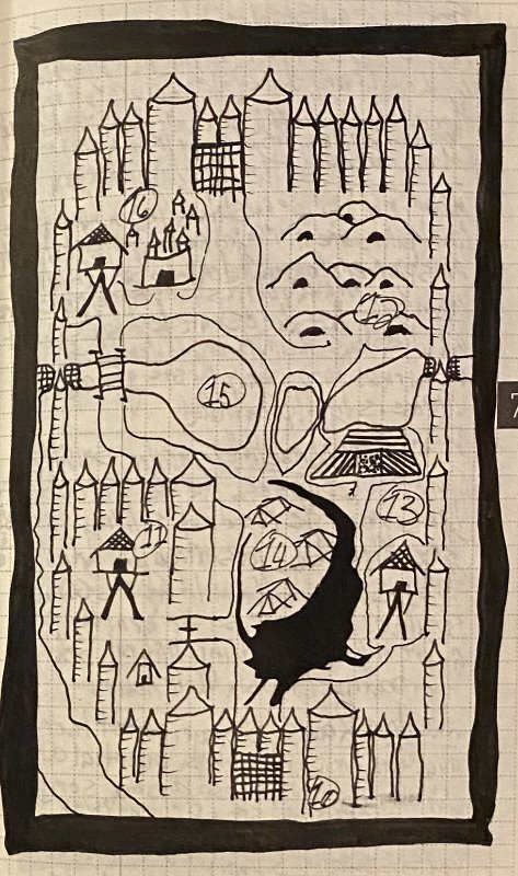
These first four images are presented to demonstrate rate of progression (or lack thereof) and serve as contrast to the following images. Fig. 3 is a map I drew for a 3.x game that never got off the ground. This was in the wake of Skyrim’s initial release and was an excuse to jam in as much stuff from Frostburn as I could. One of my prospective players said “we live in Alaska, why the fuck would I want to play in a setting where everything is cold?” So that was that.
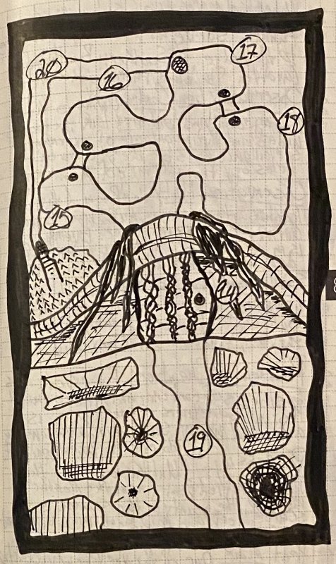
Fig. 4 is the draft topo map I made for Brewers and Brigands. An early example of a more site-specific map, and ~10 years after the previous map.
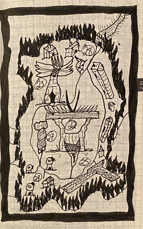
Figs. 5 and6 are from the last weeks of ‘22 and are the first maps I did for dungeon23, and thus the first maps of Basking Meadow. There’s more elements at play here (we have now some swamp branches, grass tufts, and deciduous copses) than in the first map, but the spruce trees here are still similar. The appearance of these new elements comes after I’d watched some youtube map-making videos, but before I had really implemented those concepts/techniques. JP Coovert is the primary source, though there’s others I’m forgetting. JP’s instructional videos are very approachable and easy to follow, so I recommend them highly. He’s quite an exceptionally animated/excited individual, which gets overwhelming fairly quickly for me but YMMV.
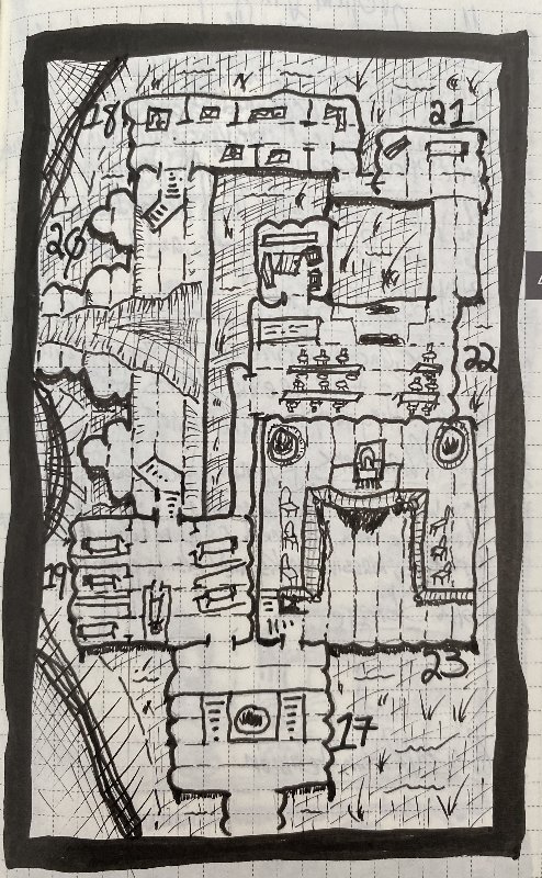
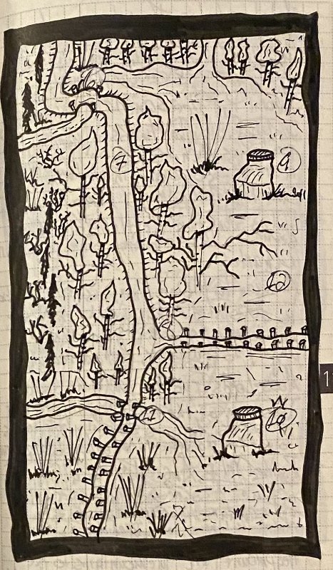
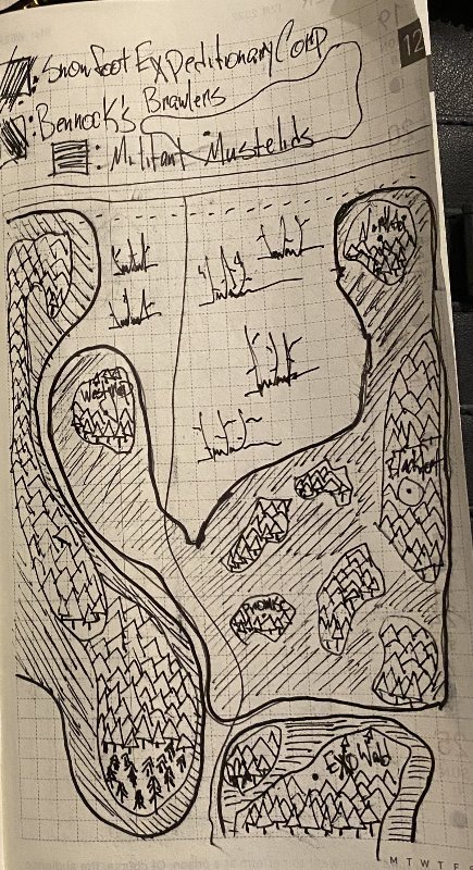
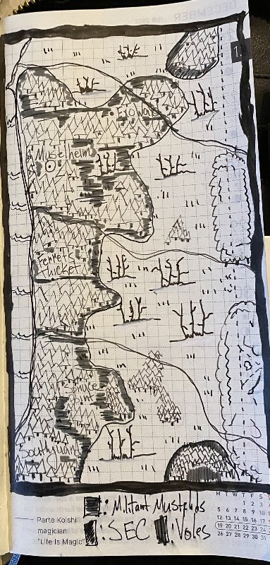
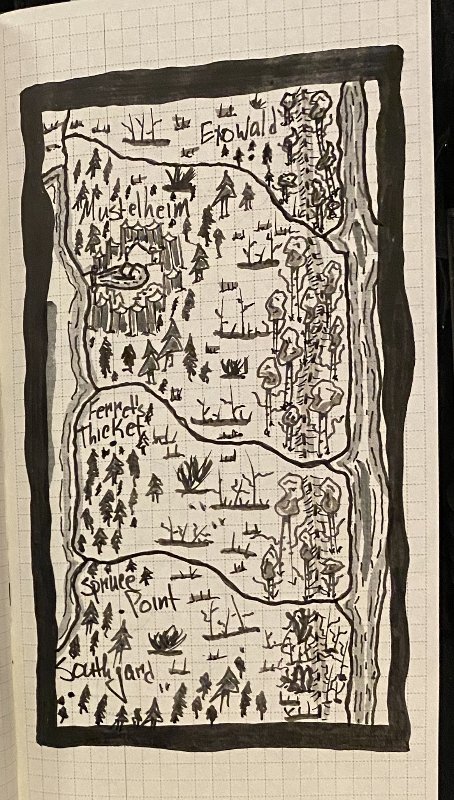
For those unfamiliar with dungeon23, in late ‘22 Sean McCoy of Mothership proposed a challenge for the upcoming year: create a megadungeon by writing one room per day. I’m not sure what the stats are on people making it across the finish line on December 31st with entries for every day, but I’m one of them. I now once again have to tap the “subject for another post” sign, as the pertinent point here is that I proceeded to make a map a week for the next 52 weeks. Let’s skip right to the last one I did, which is conveniently a redo of fig. 6.
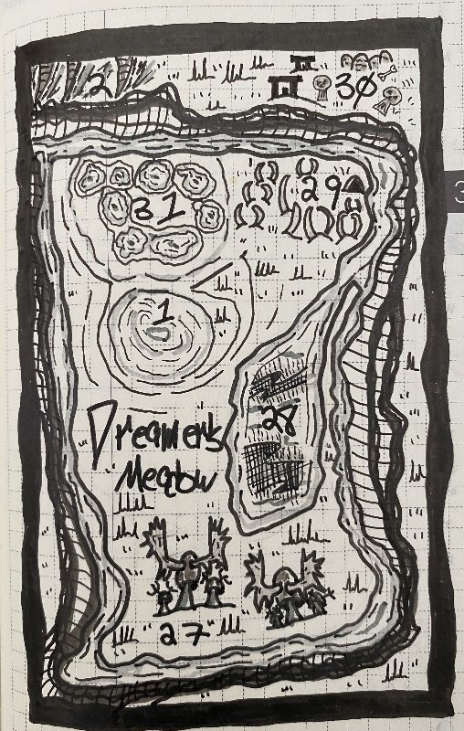
(fig. 7)
Dang look at me go! The use of gray tones helps differentiate groups of symbols and separates the frame into distinct regions, the main settlement has an actual icon, and all of the symbols are more varied and detailed, which does a better job of both indicating the specificities of the landscape and the emergence of individual style. Now I list all these improvements not to toot my own horn (though being able to honestly recognize your improvements is fuckin’ essential) but to give a tangible and direct example of the results of consistent practice.
I think it would be preaching to the choir to use my remaining characters to excoriate generative AI, especially since the content of this post already does just that.
Now of course, as many others have said, the process is just as much the point as the product, and so far we’ve only seen the beginning and end of a yearlong project, thus missing all the interesting middle bits. I settled into fineliners and gray brush pens early for the larger regions, but I also tried a variety of other pens with mixed results (all on Tomoe River paper). I might do another post on the various pens I used, but it’s wasted characters here, so to wrap up here’s a chronological assortment from across the year. I think some of these are bad/annoying, and at least one is the result of equipment failure, but so what that’s the point.